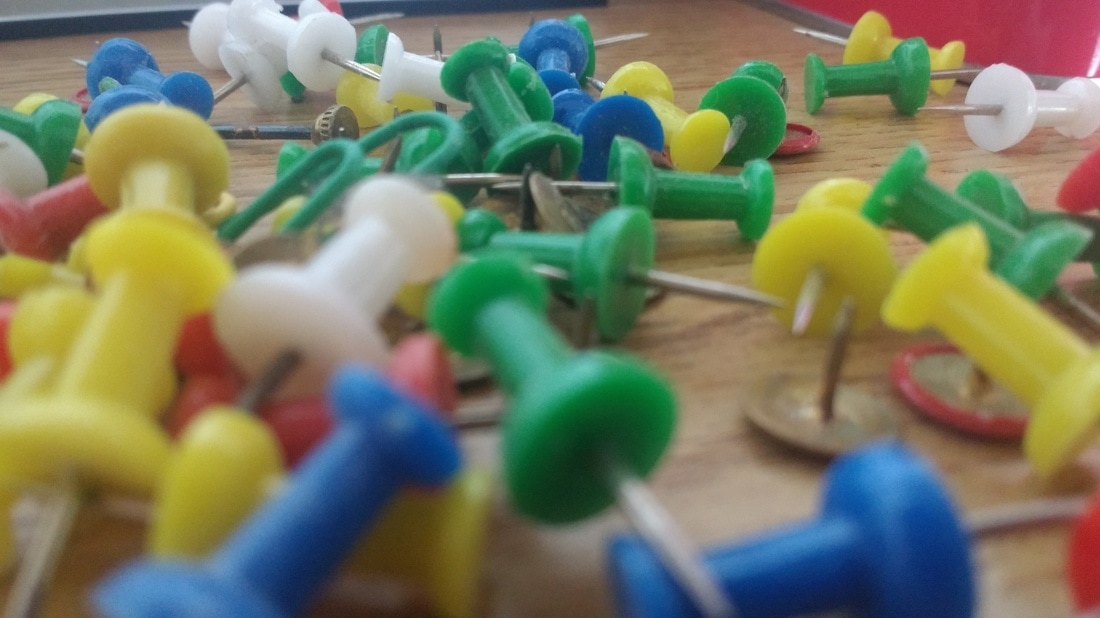
Photographs of Edges...
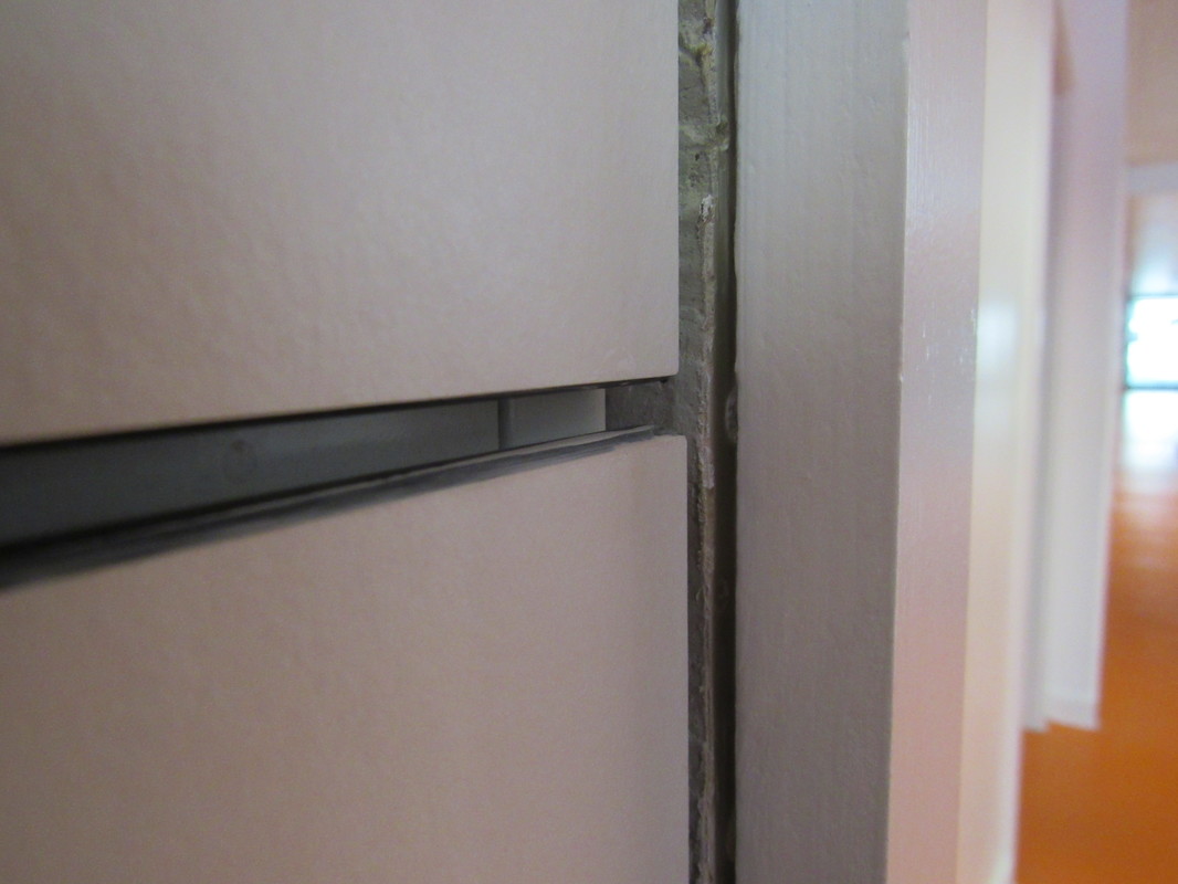
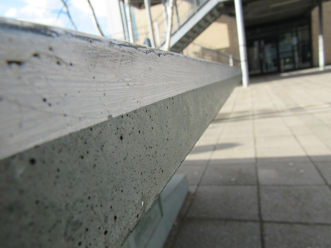
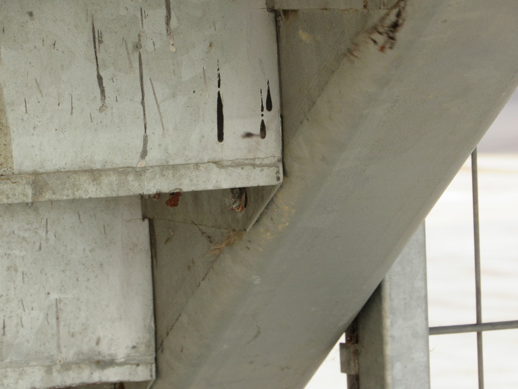
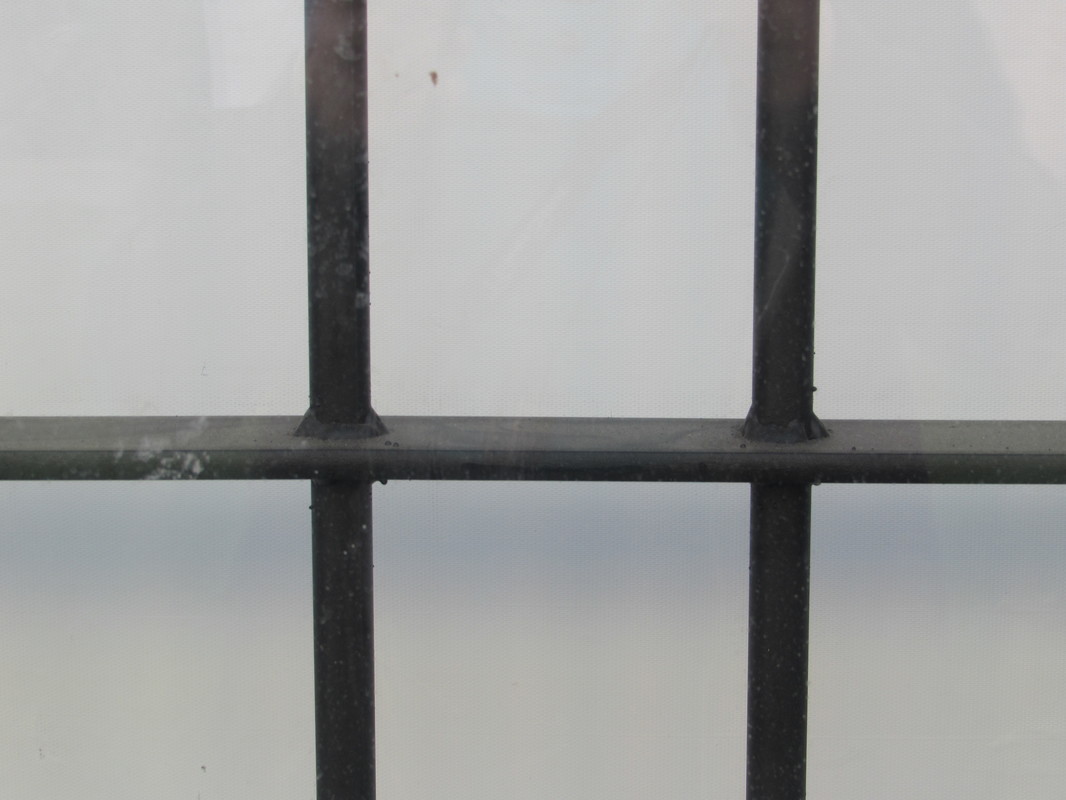
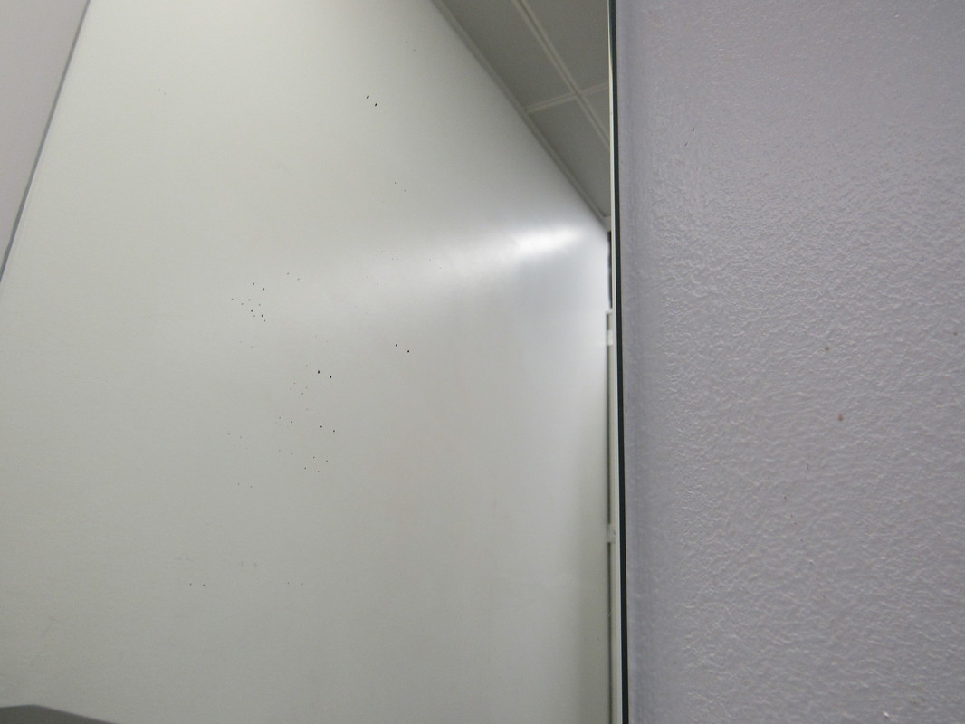
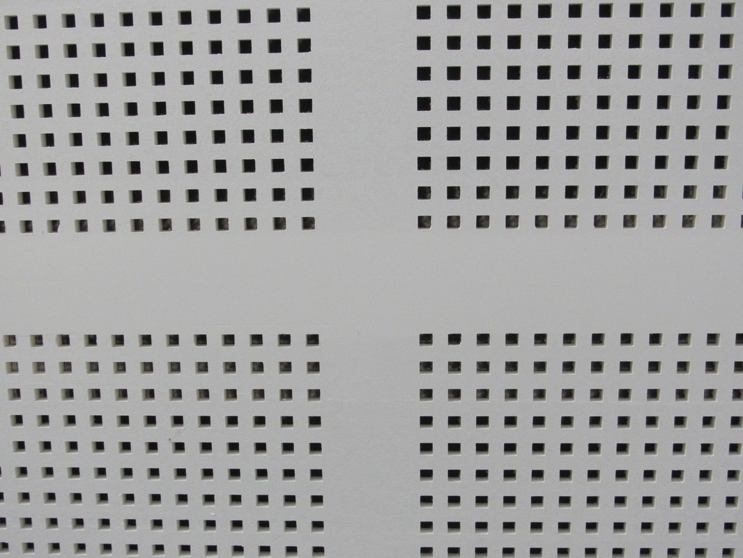
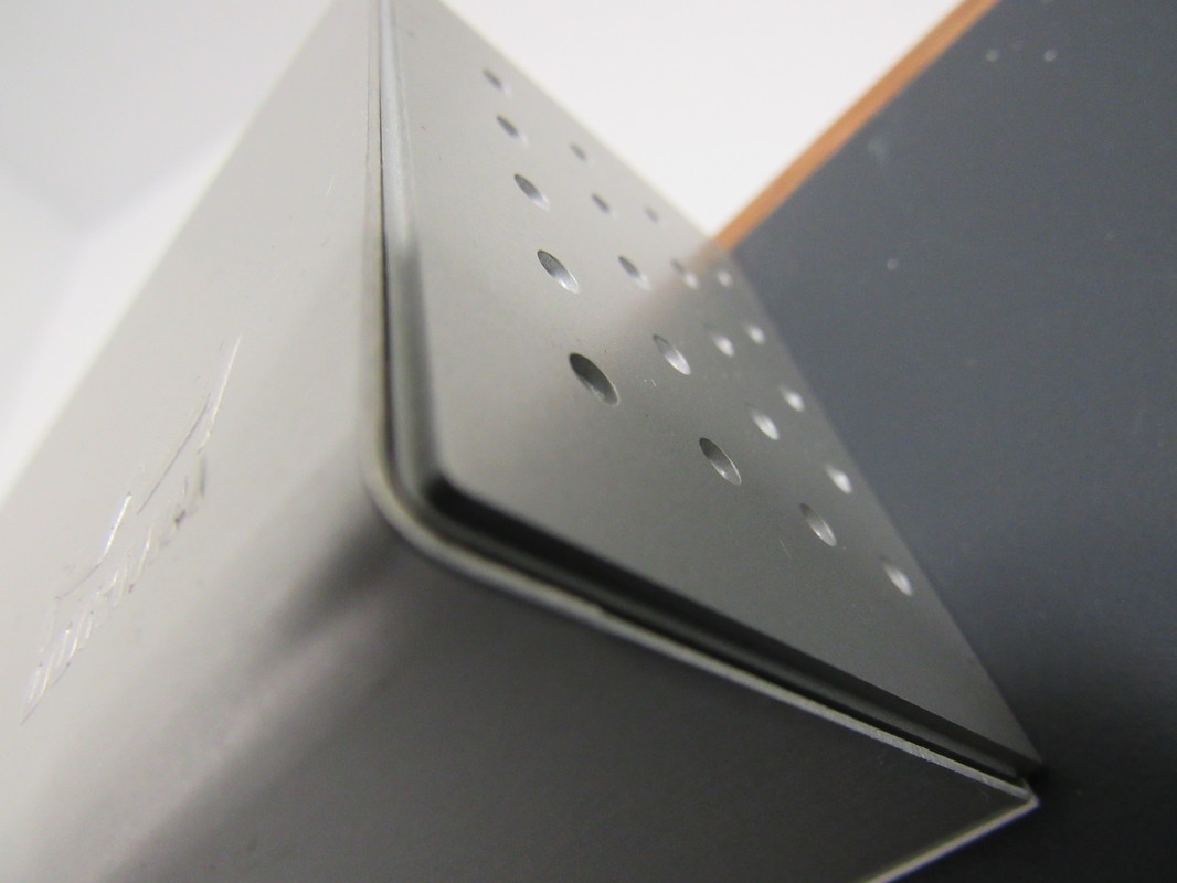
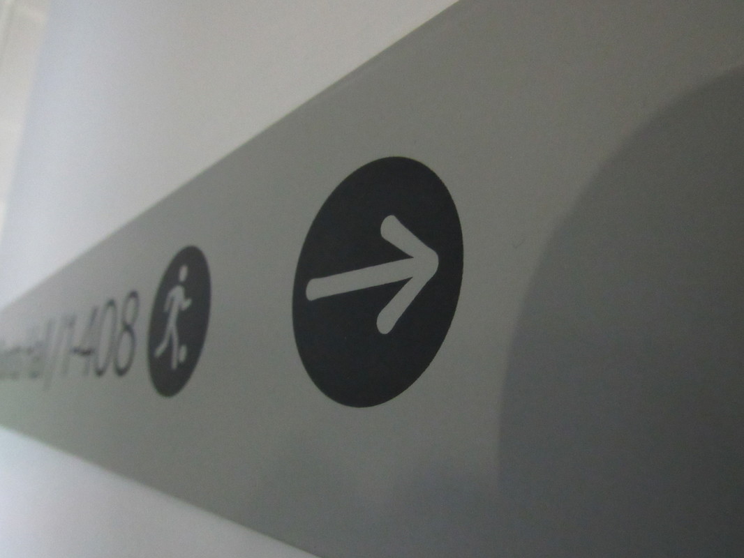
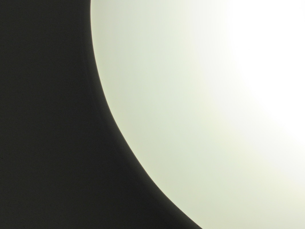
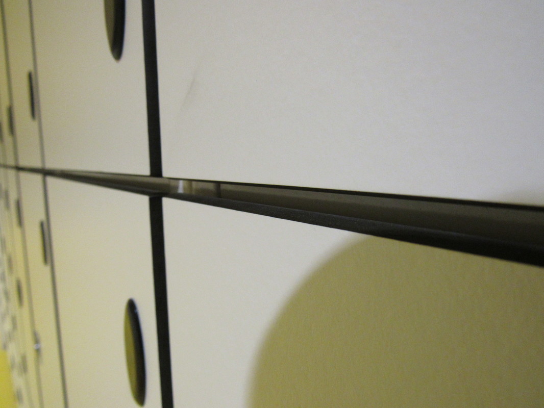
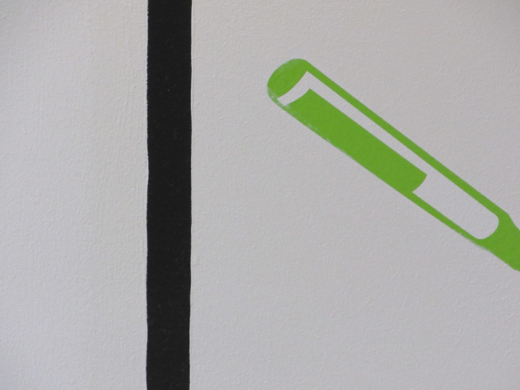
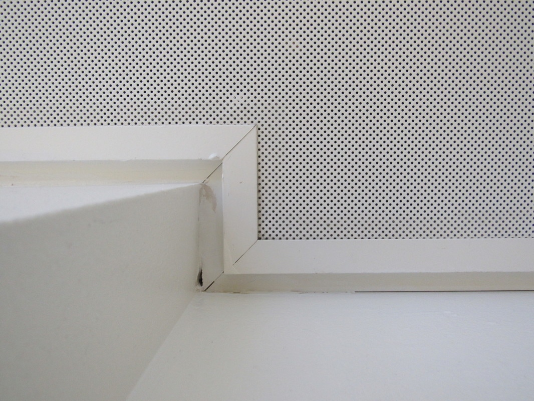
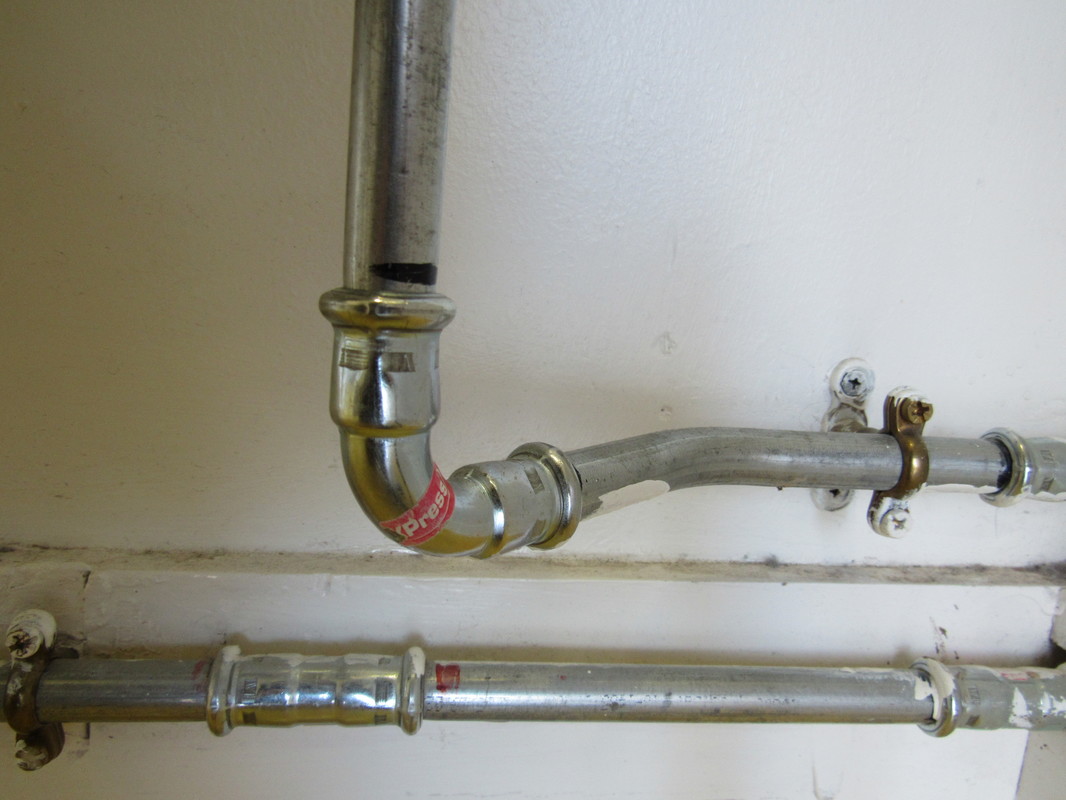
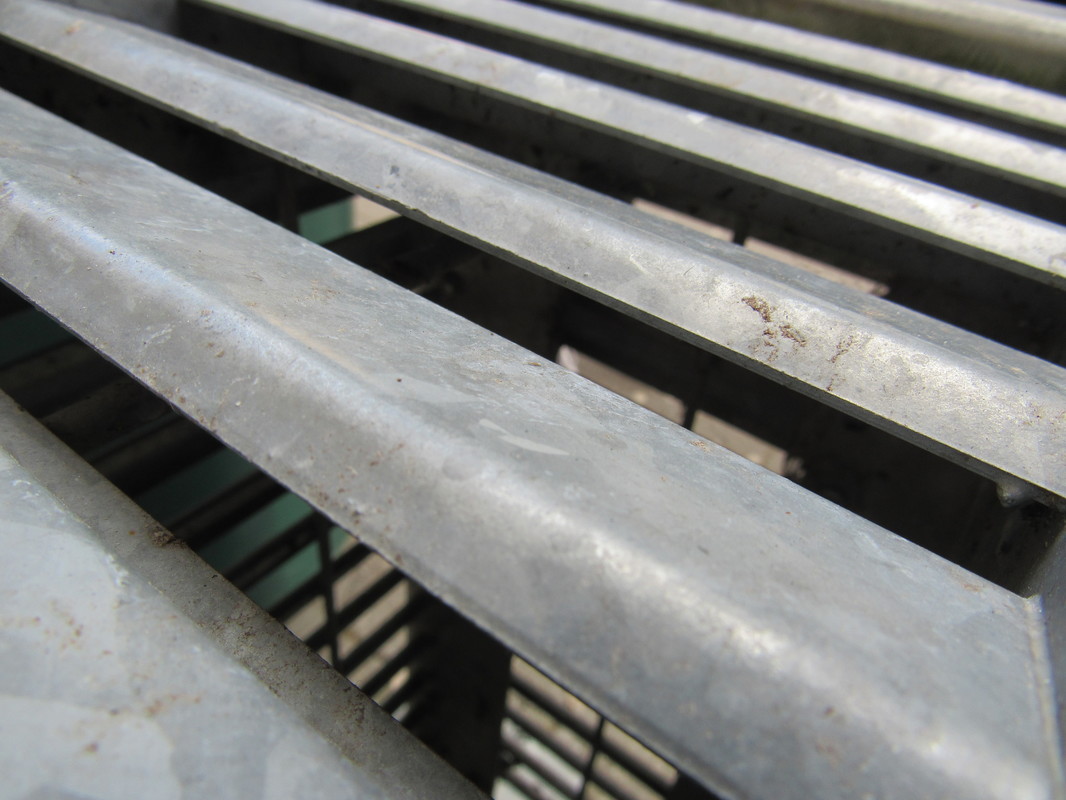
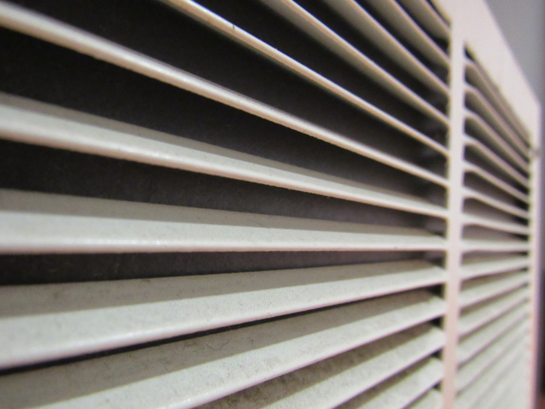
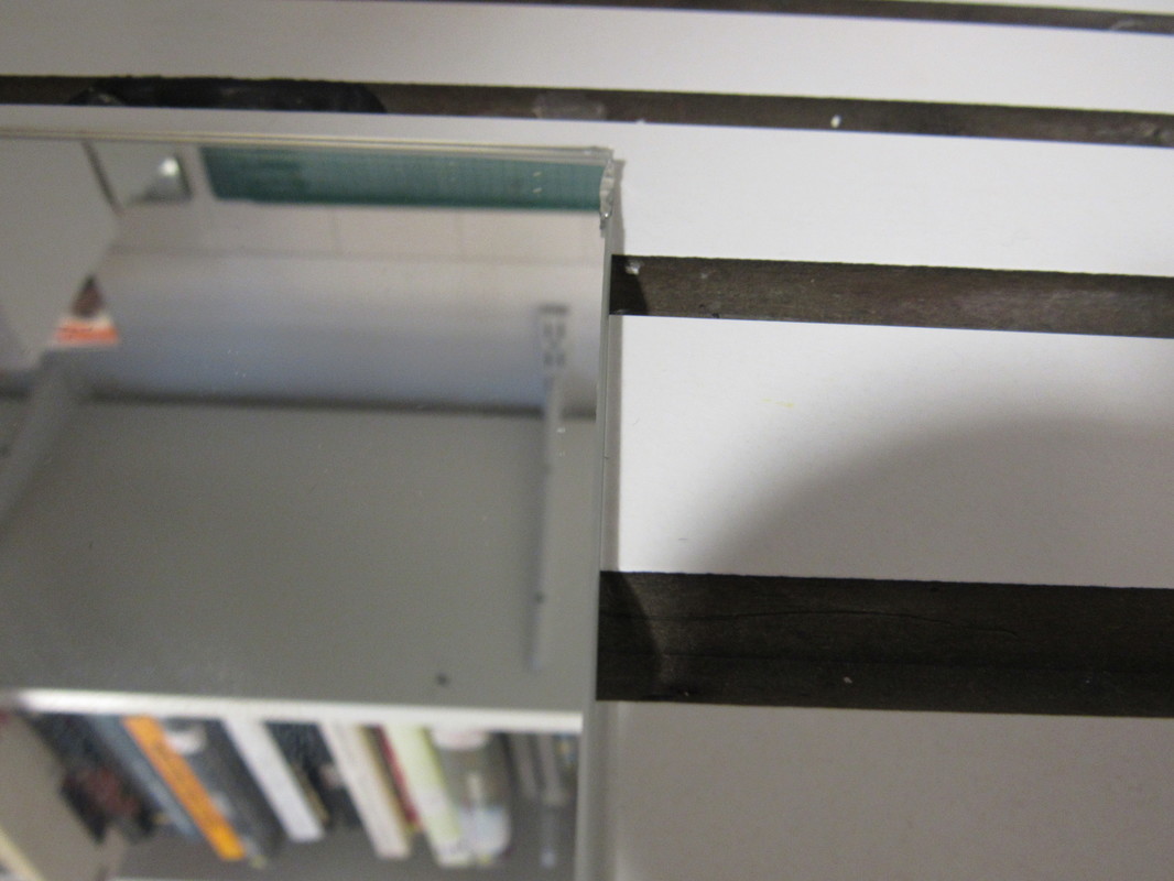
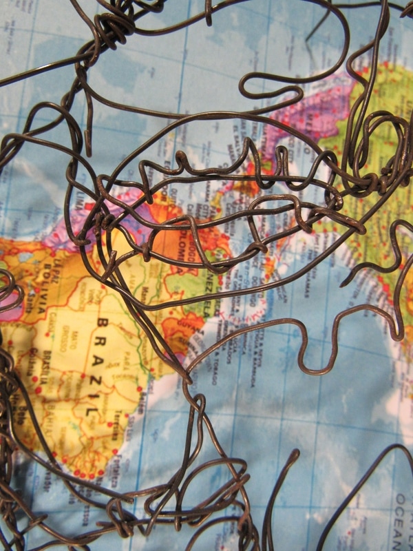
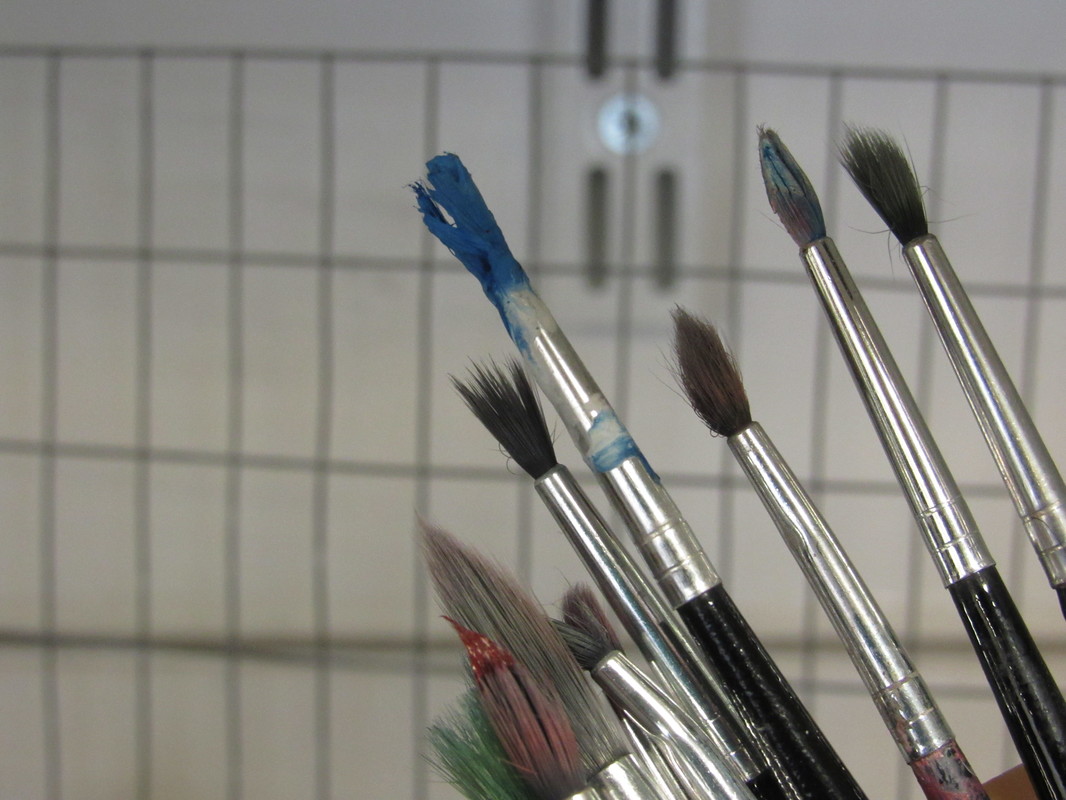
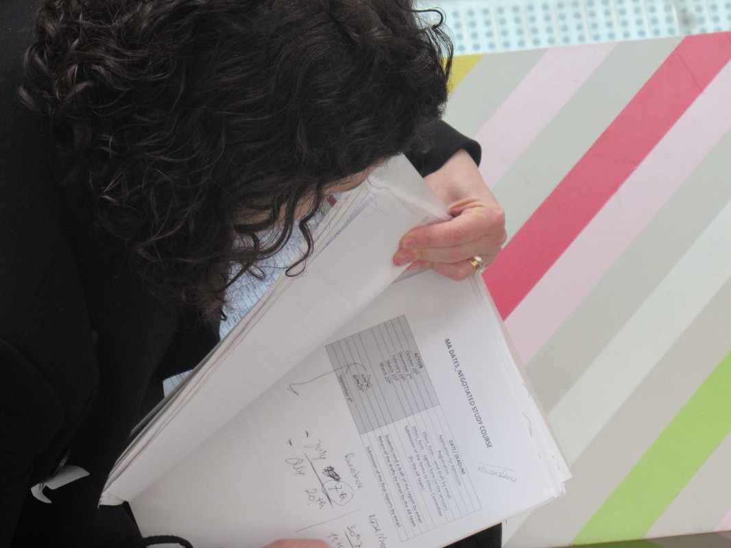
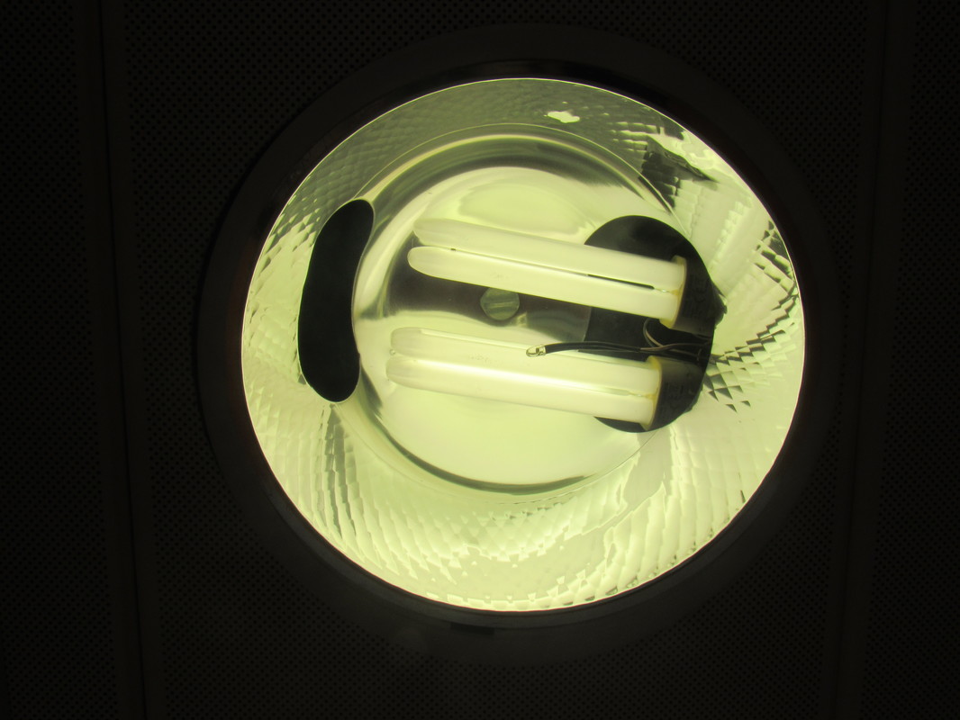
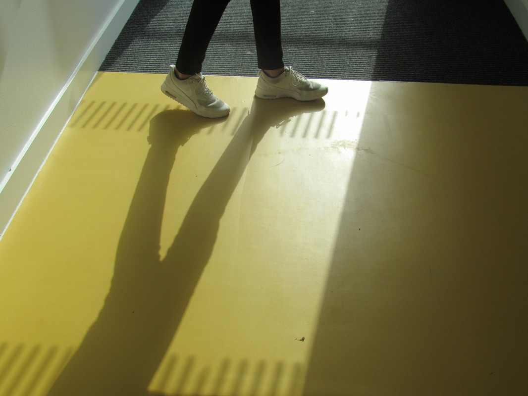
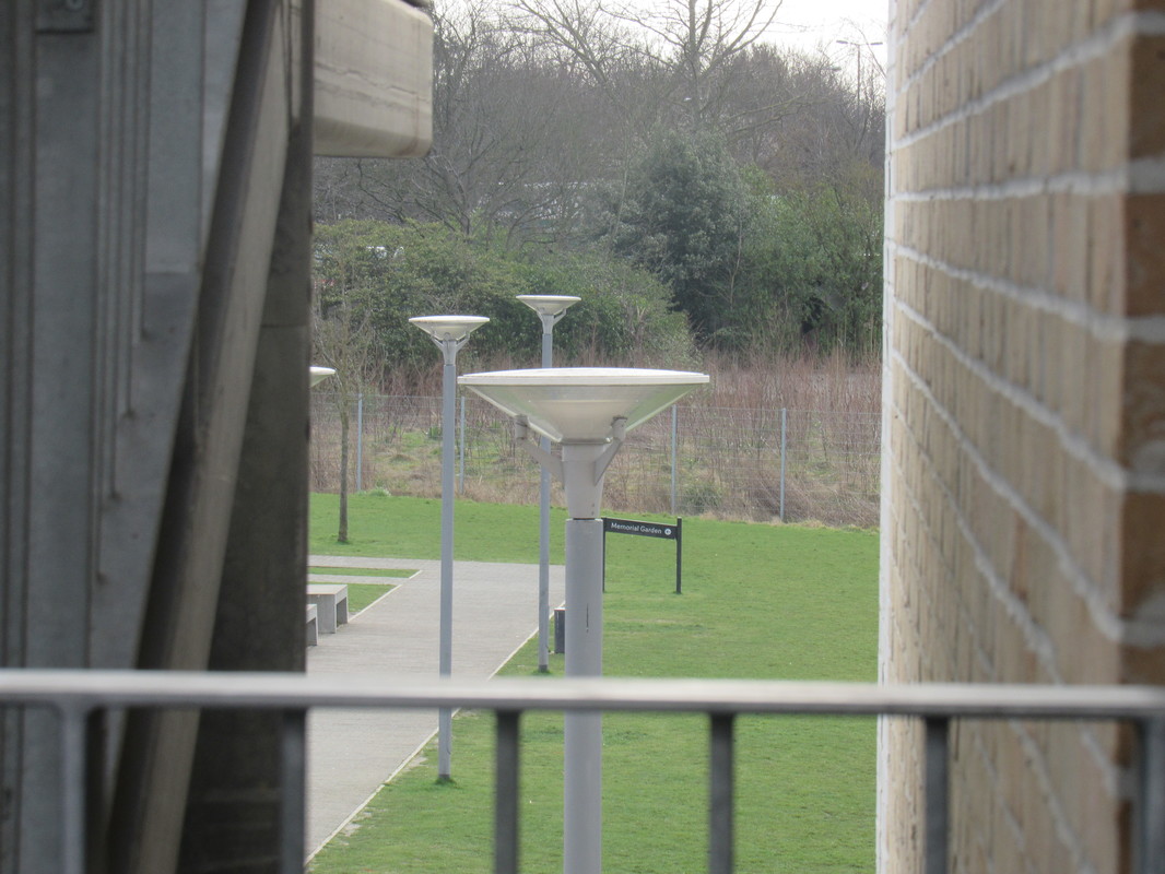
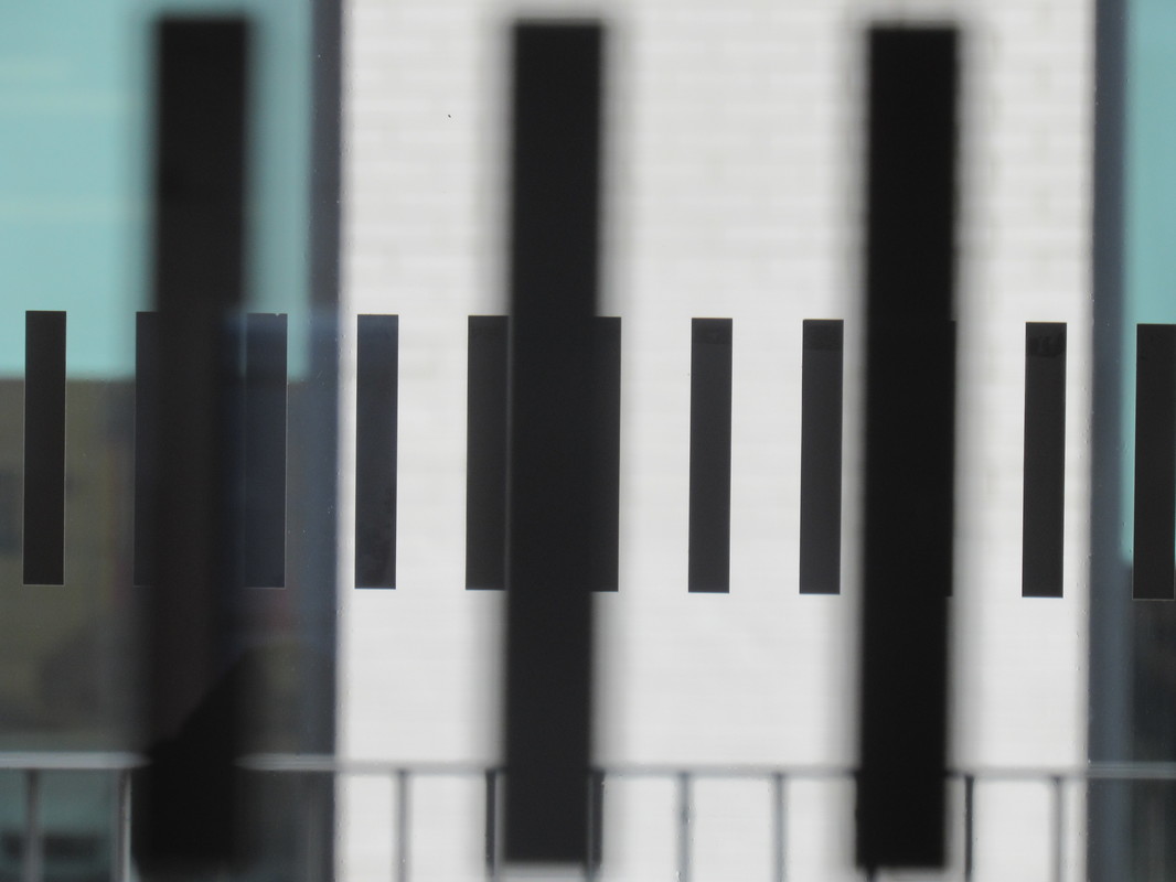
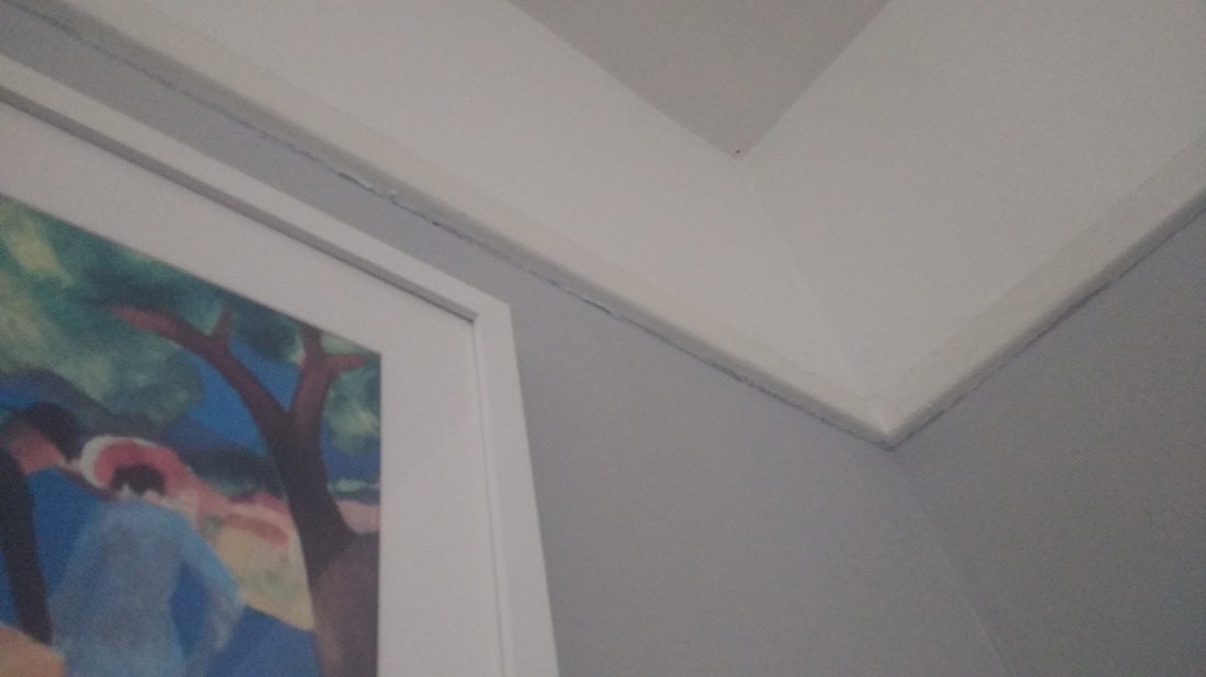
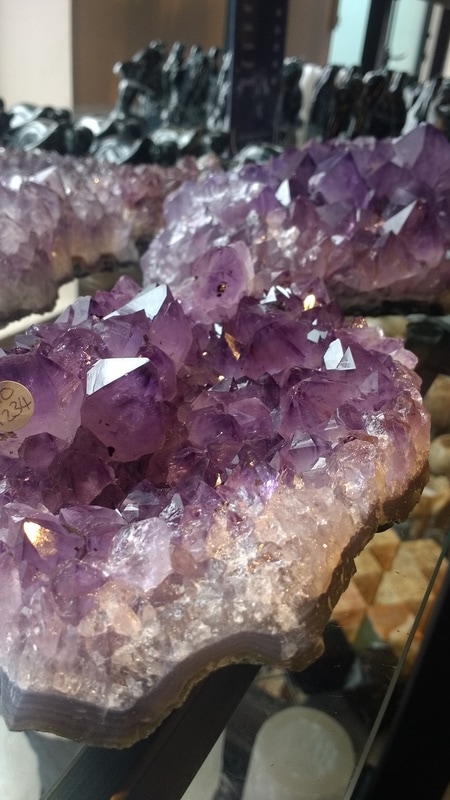
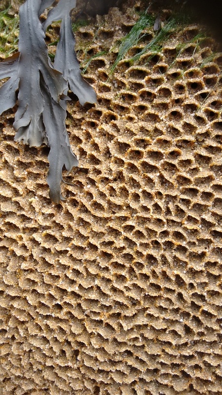
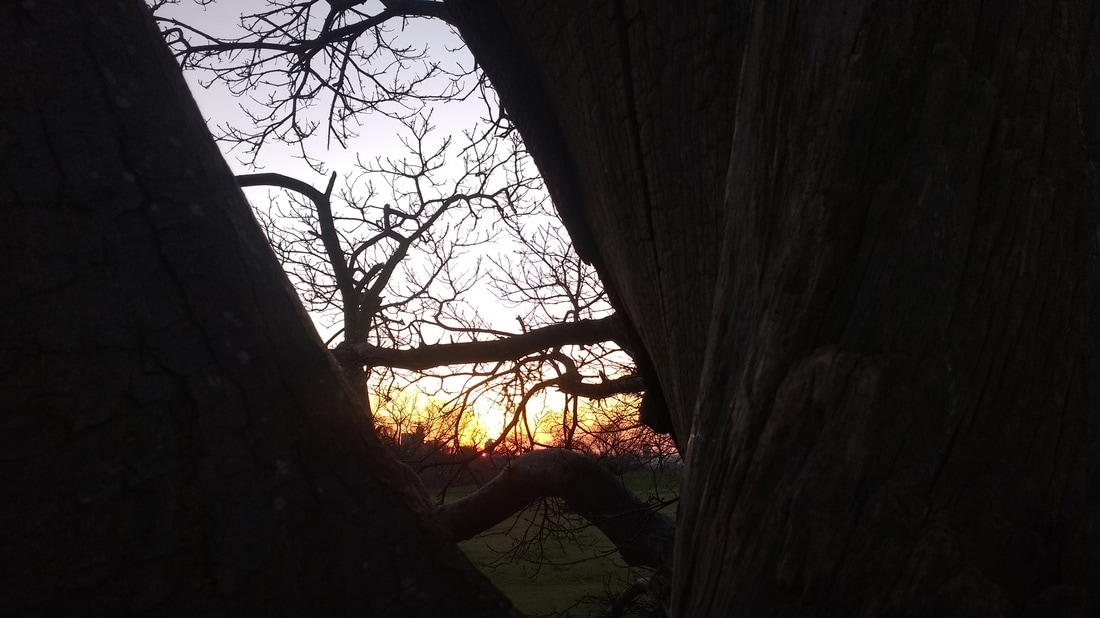
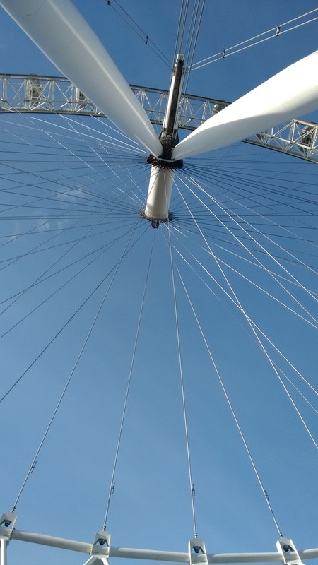
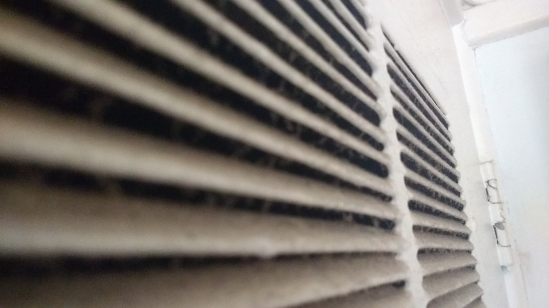
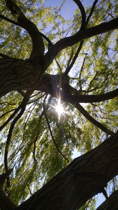
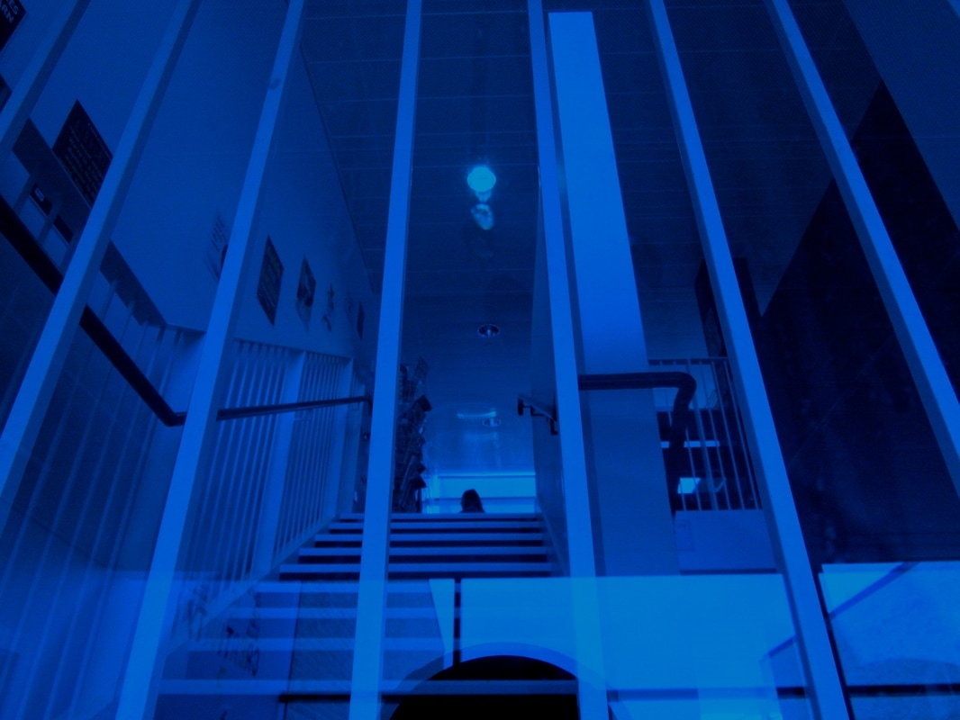
In this 'edges' task we had about an hour to go wherever we want in the school and take images of edges of objects , either using close up, depth of field or cropping. I thought this task was fun and challenging at the same time, the fun side of the task was because you could just go around school taking photographs, which I find a enjoying thing to do, and the challenging side of this task was because you have to think really hard about the images you are taking , to see if they have edges, If it was on your list of things to photograph, if they were either close up, depth or field or cropping and I had to try all of them to see which one looked best for the type of images i was taking and I thought for this task the technique that worked the most for me was close up as you can really see the edges of the objects and makes the edges stand out more, especially when you go from the side of the edge. Overall, I think these photographs that I have taken have turned out successfully as each image contains edges within them and this then makes them apply full to the theme of edges. I also like how I have tried a variety of techniques when taking these photographs as it makes them look more unusual and interesting to view. However, I also think that these photographs have negatives towards them, such as, I don't like the subject matter within most of these images as they look very dull and generic. So next time I will try and improve upon this fault and try to photograph subject matter that looks more intriguing and unique.
Lucio fontana...
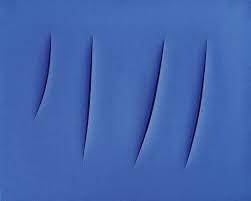
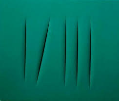
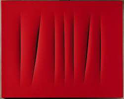
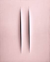
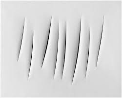
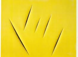
The thing that i like about Lucio fontana's photography and artwork is that its very interesting ,simplistic and minimalistic. I also like how he cuts the slits into really vibrant, colourful paper as it makes the dark cuts in the paper stand out more. Another aspect of his work that i like is how he cuts the slits in the paper in a un-arranged order and in doing so, it makes the photograph look more effective as it looks less neat and more abstract. The composition of his photography is very simple but yet effective as all of the slits in the photographs are all in the centre on the image and this draws all the audiences attention right onto the cuts of the paper which it the main focus of his photography.
- Simple
- Bold colours
- Sharp
- Unusual
Dolores Marat photography...
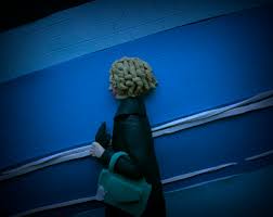
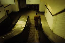
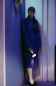
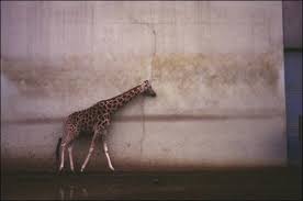
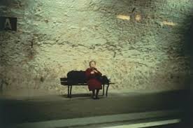
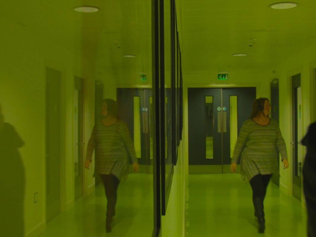
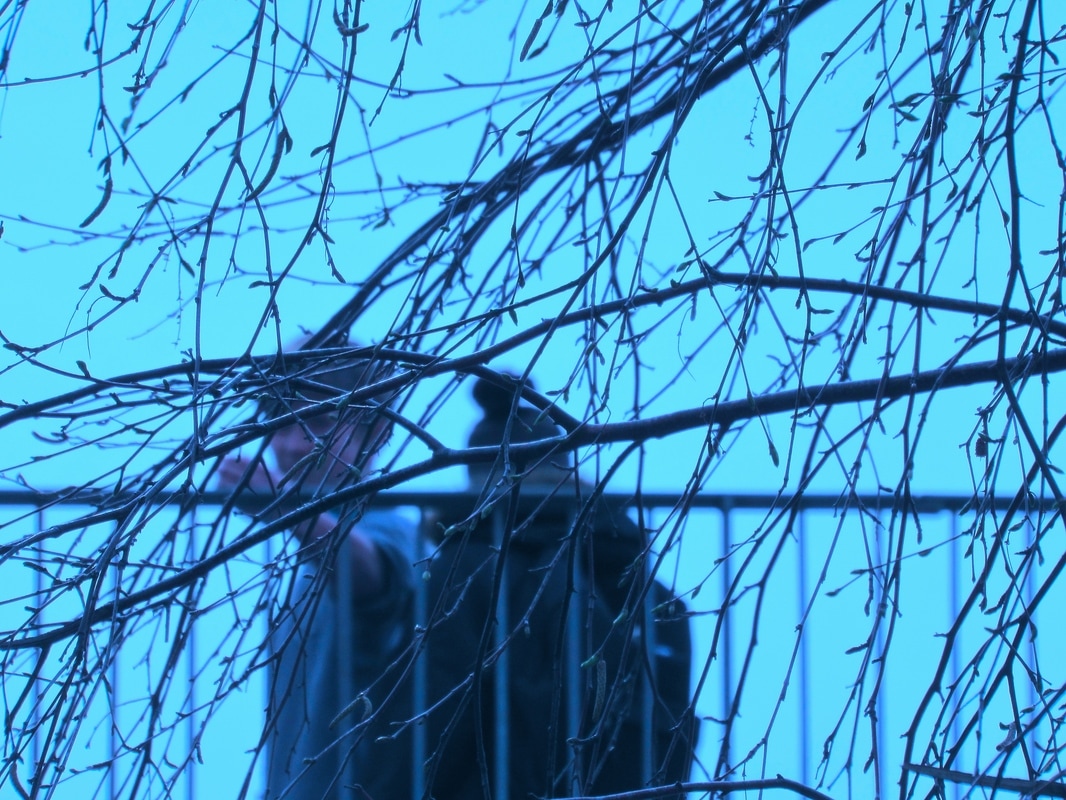
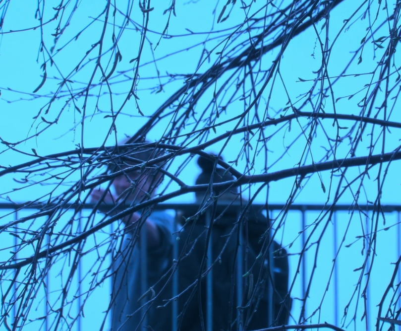
These images above are from a photographer called Dolores Marat who specialises in the theme of 'Edges'. In these 6 images the main thing i like about them is the composition of these pictures, the composition in the first image looks as if the woman was there just out of the blue and it also looks like she purposely doesn't want to look straight into the camera and this kind of creates a mysterious effect because it seems like the woman in hiding from something or someone. Another thing that makes this photograph stand out is the colour of the picture is very bold and seems like all one colour, for example , the background of the image in blue, the woman's coat is blue and so is her bag. And this looks quite strange as nearly everything she's wearing is blue and so in the background. This photograph also creates a sense of loneliness, just like all the other images i picked. The way the first photograph shows loneliness is because the woman is on her own with not much people around her apart from the photographer taking the image and this would obviously kind of create a sense of loneliness to the people who view this image.
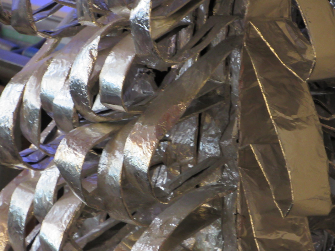
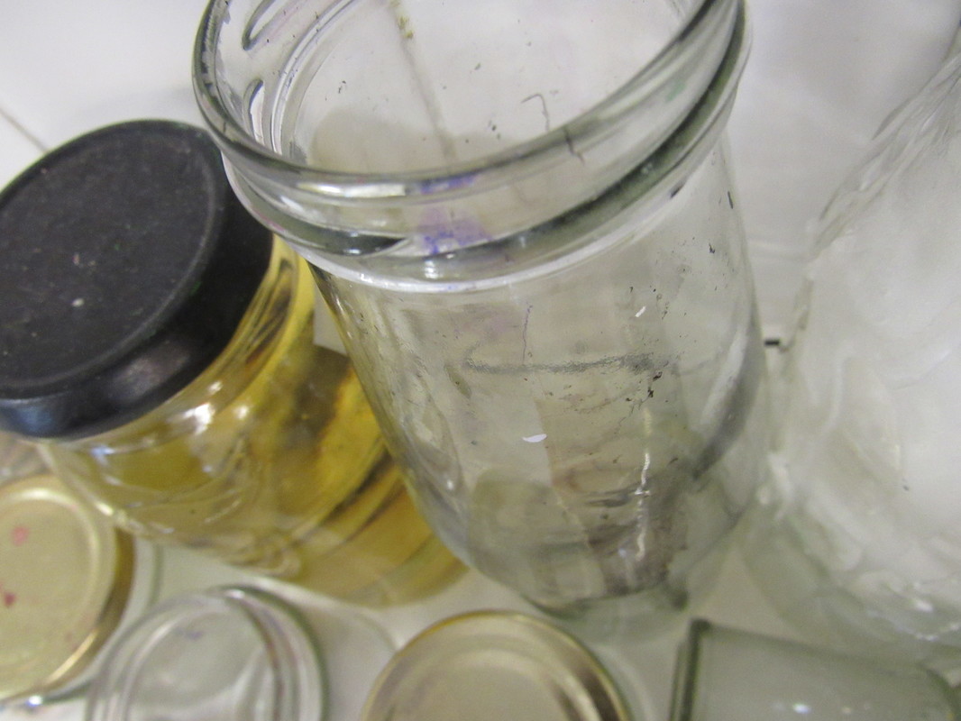
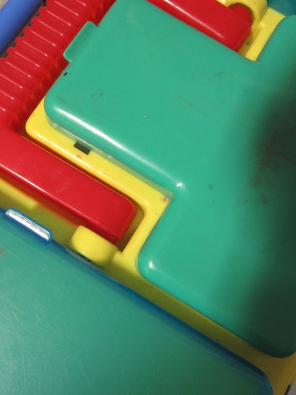
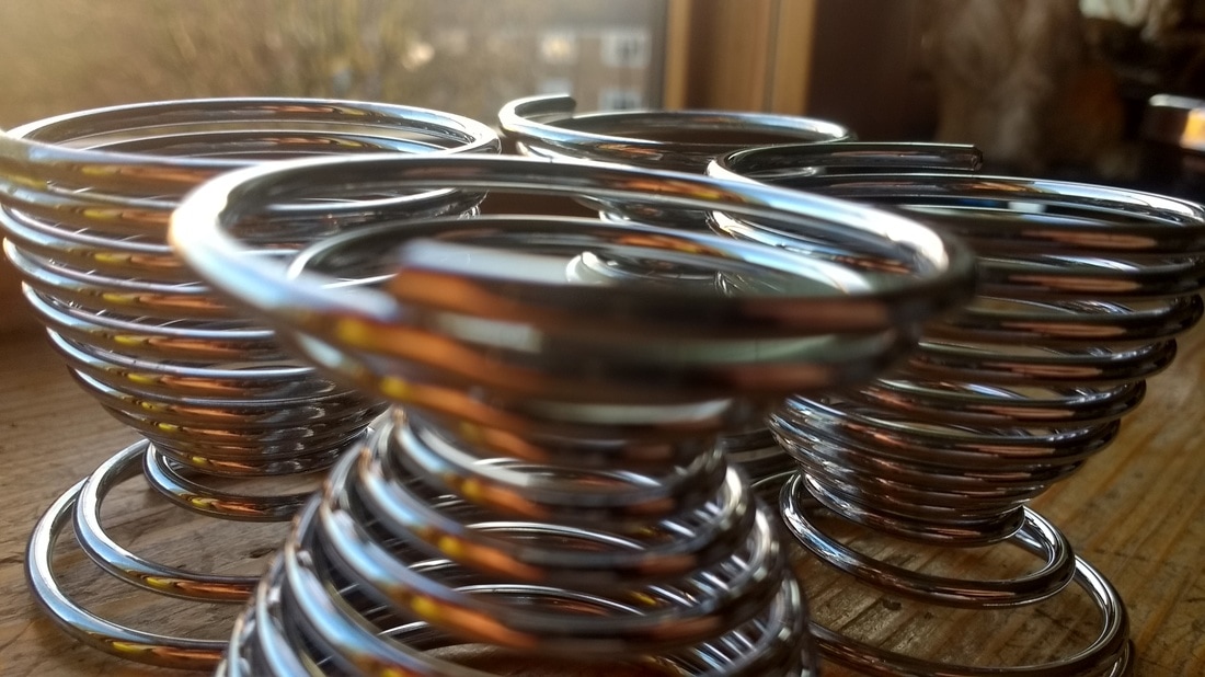
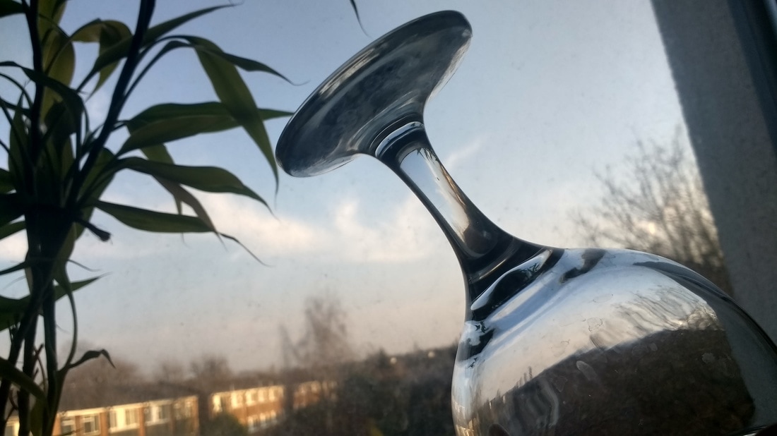
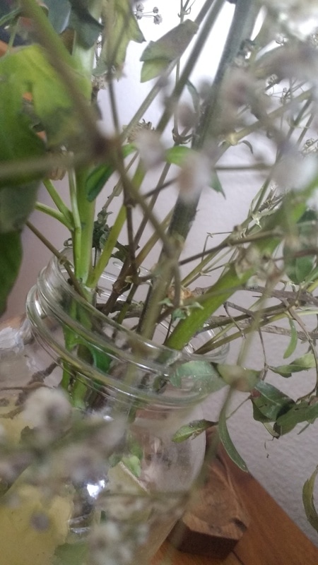
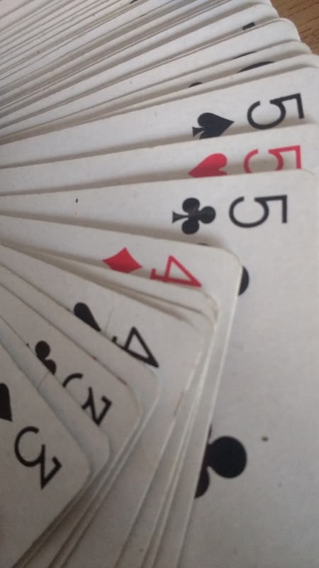
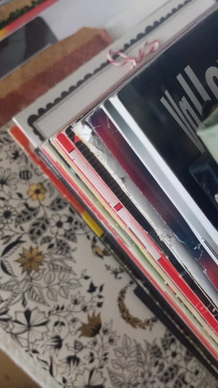
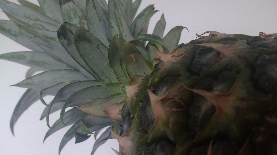
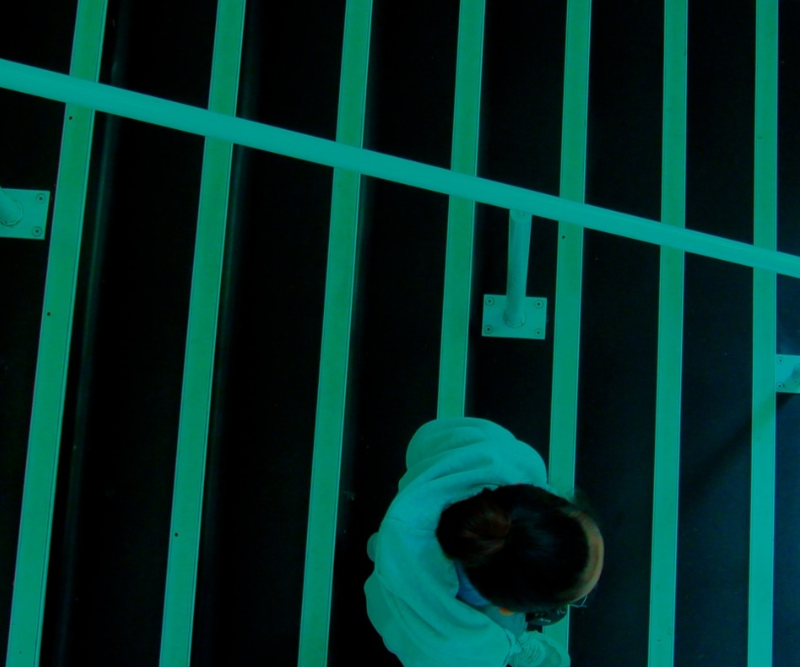
My photographs...
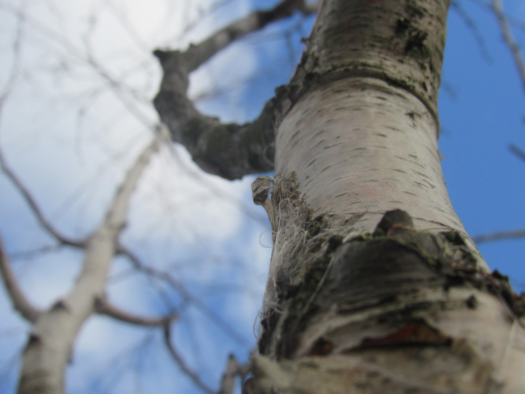

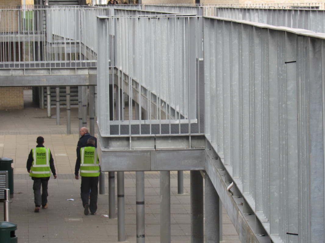
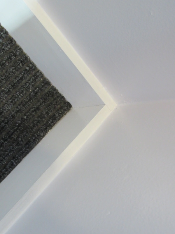
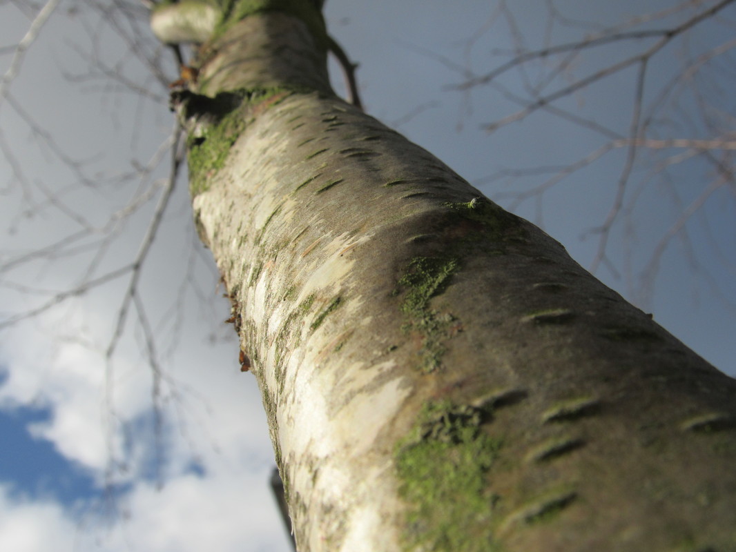
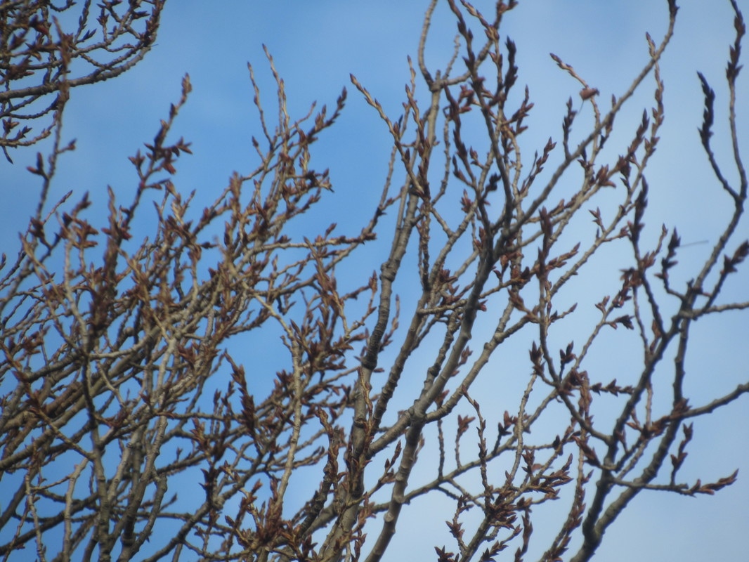
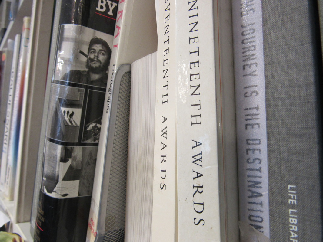
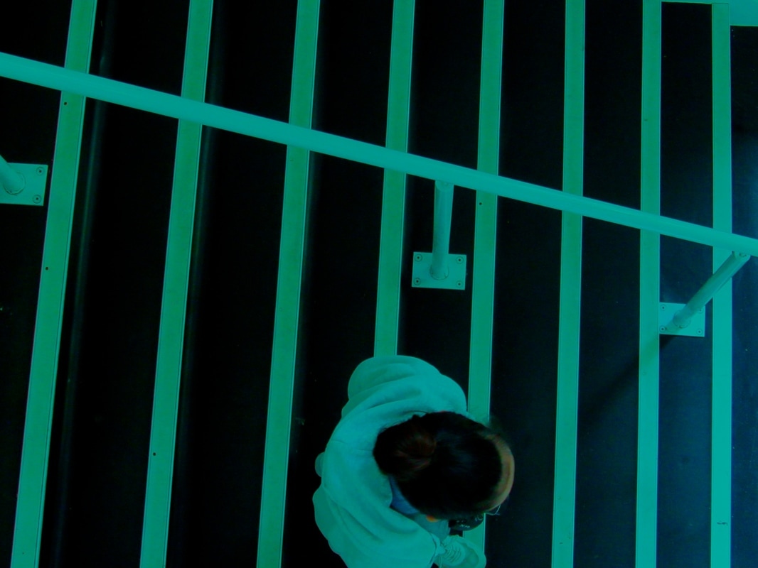
Our task was to take pictures around the school of Edges. I thought this task would be simple as edges are in nearly every object, however when i was doing it i found it quite challenging as it was hard to take interesting pictures with just the edges of objects. Overall, i think my photos are very rushed, however i did include edges within my photography. If i was to do this task again i would think more about the picture than rushing though this task.
Photograph experimentation...
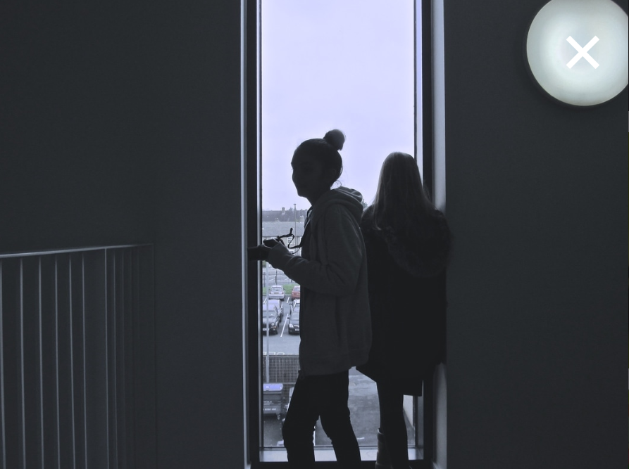
Dolores Marat inspired photos...

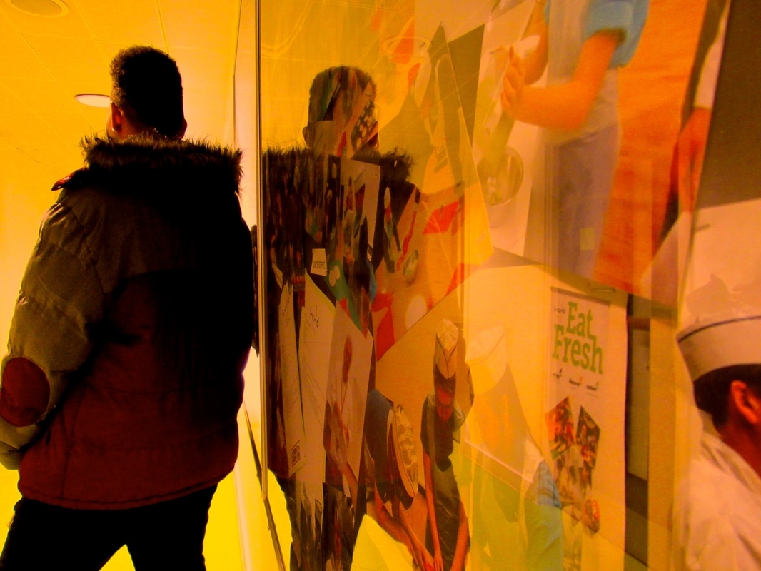

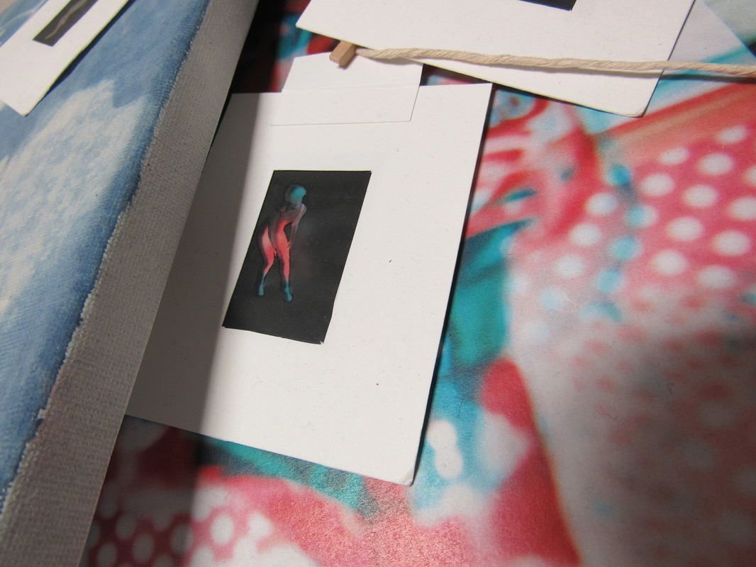
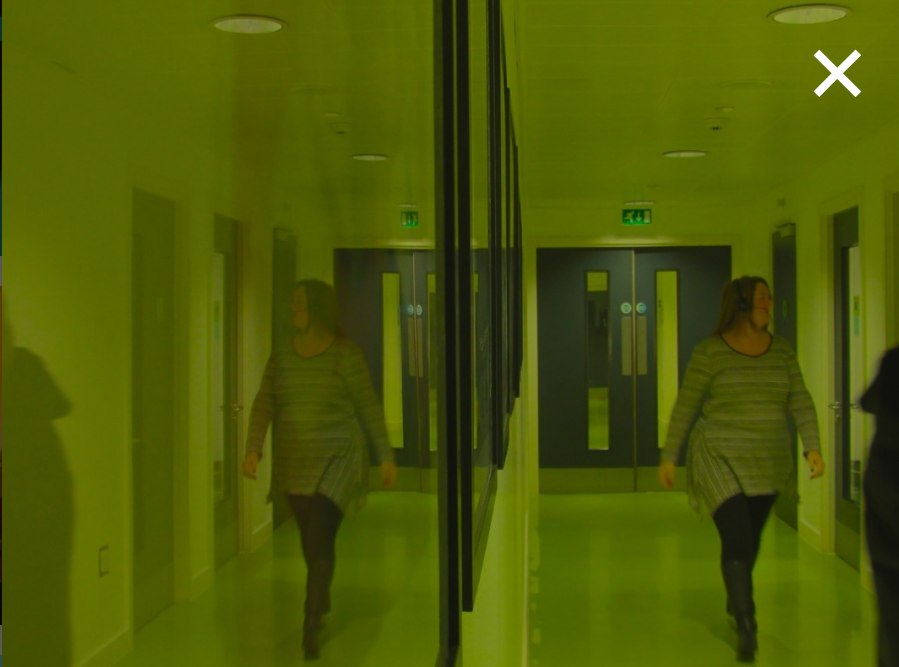
These photographs are inspired by a photographer named Dolores Marat. Dolores Marat's photographs are usually quite abstract and unusual. The types of photographs she takes are mostly taken on the street and edited to make them look quite gothic. The way she makes them look gothic is by editing the images to make them darker and put a colour wash/filter on the picture and this makes the photographs look more mysterious and depressing. I really like how she puts colours onto her photographs because it makes them stand out more to people as they look very unique and bold to catch the audiences attention. The way i tried to re-create her style of photography was i took pictures of edges of objects and singular people walking by, hiding their own business, I did this as I saw that she did that in quite a lot of her photos and then after I took the photos i edited them on photoshop and put a colour wash on top of the photographs and made them darker to create the 'gothic' style she uses in her pictures. Overall i thought my finale images came out successfully as they look similar to Dolores Marat's photography.
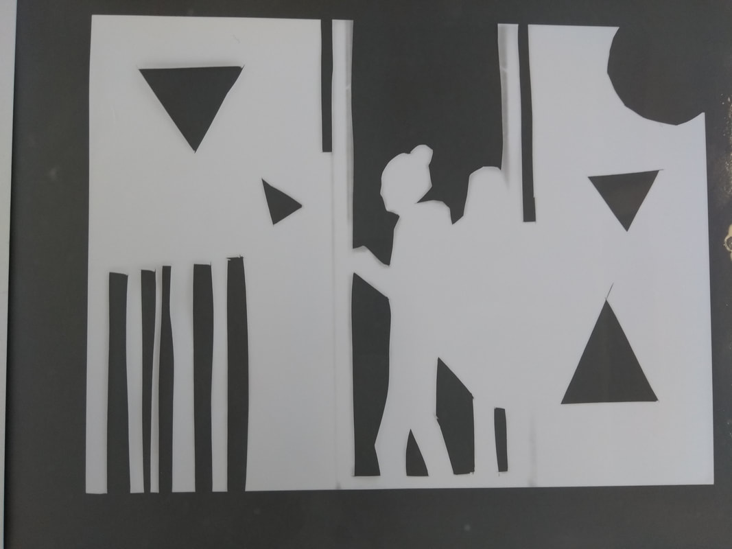
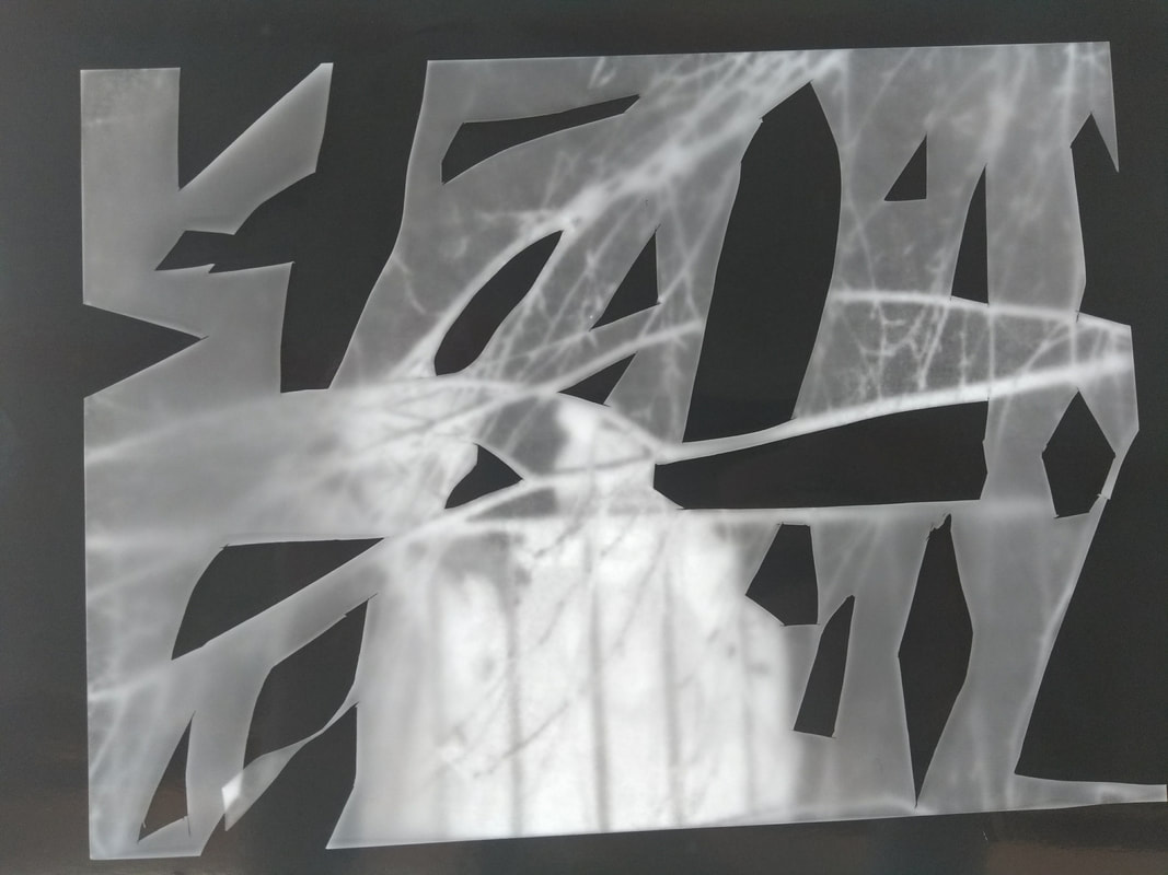
Experimentation...
I started this experiment by choosing four of the most successful photographs I have taken for the 'Dolores Marat inspired' photograph series. I think these images above have turned out the most successfully as they look the most interesting as they contain many shapes within them and have intriguing subject matter. I then decided to print these photographs out and went onto experimenting with them. The way i experimented with these photographs was by using a scalpel, i cut out the edges and interesting subject matter within these images and took them to the darkroom and placed the images above photographic paper. At first I exposed them for around 12 seconds with light and then placed them in the developing and fixing liquids, when the photogram finished, I could clearly see that it looked very over exposed, so I did another one with the exposure time of 25 seconds, this turned out better as they background looked darker and the photogram as a whole looked less exposed compared to the first attempt, however, I still wasn't happy with how this had turned out as I still thought it looked way over exposed, so I attempted to do another experiment using the exposure time of 50 seconds, this photogram turned out the best out of the other two as it looked more clear and less exposed, however, I wasn't pleased with the colour of the background as it still looked a grey colour, whereas, I wanted the background to be black so the white (made by the image I placed above) would stand out more. I finally decided to make a big jump with the timing and expose it for 90 seconds. This photogram came out very successfully as the background was very dark and it wasn't over exposed at all, so, after I finally came to the conclusion that the best exposure timing for the photograms I am creating was approximately 90 seconds, I decided to use the other photographs that I have done and make a photogram for each one using the exposure time of 90 seconds. These photograms were a success as they all looked clear and interesting. I am pleased with how my photograms have turned out and I like this experiment, as it complies very well with the theme of 'edges' as each photogram contain many different types of shapes within them and these shapes contain a variety of different type of edges in them which make these photograms suit the theme of 'edges'.
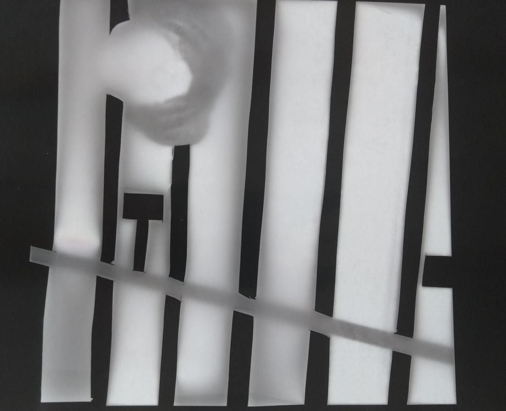
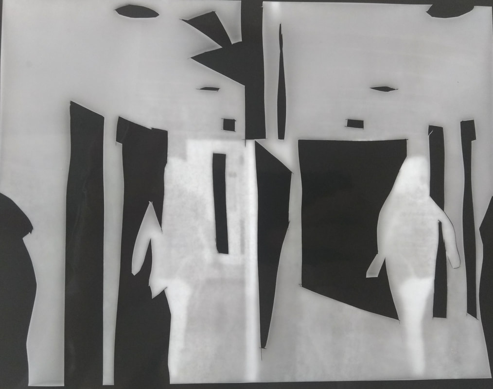
The photograms that turned out unsuccessfully...
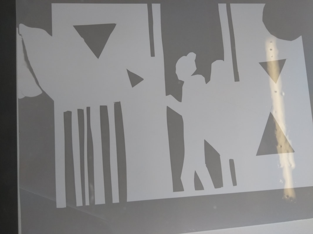
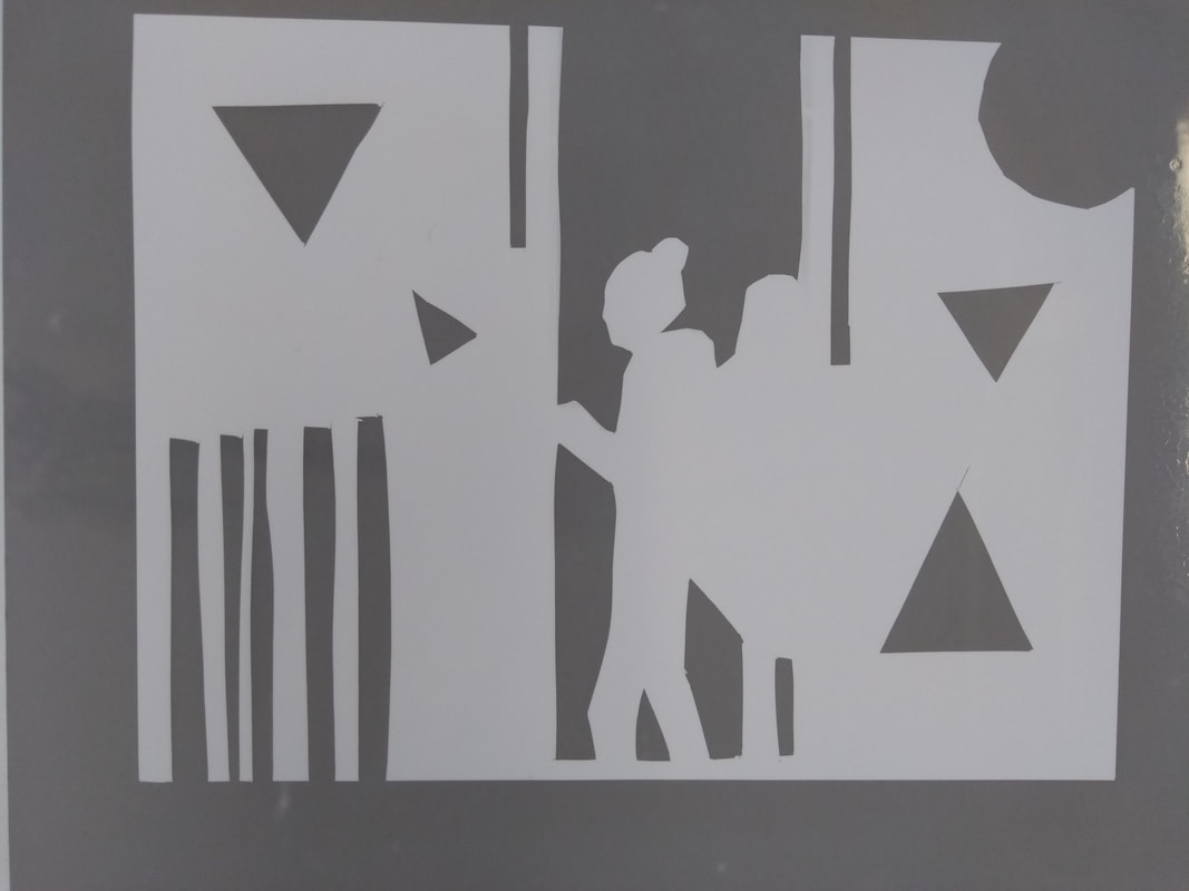
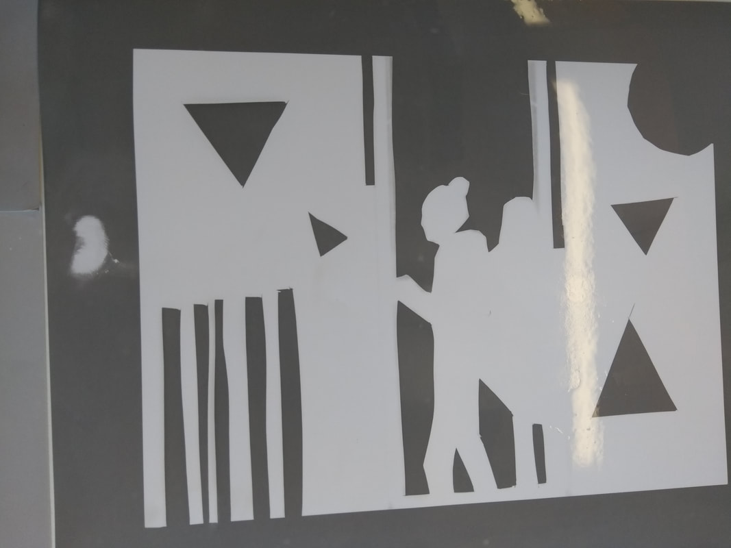
These are the photograms that I have done tuned out unsuccessfully, the reason why they have turned out unsuccessfully is because they were overexposed. I am not pleased with how these photograms look as the background looks too light and so, the foreground doesn't stand out as much as I would of liked it to. However, I am pleased I have done these experiments as I figured out by this process the exact time I should expose the pictures for in order for them to turn out successfully.
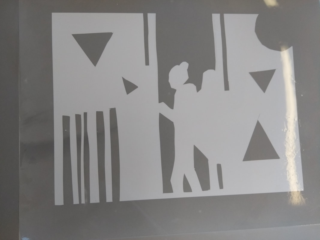
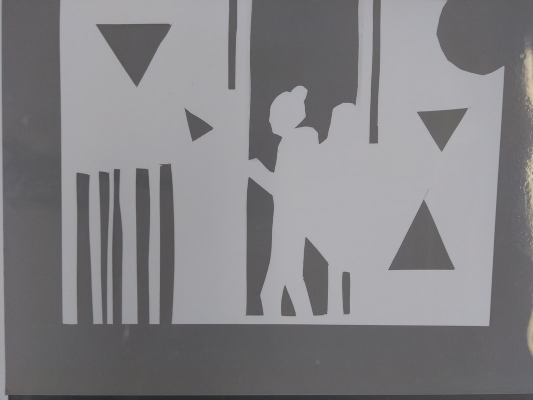
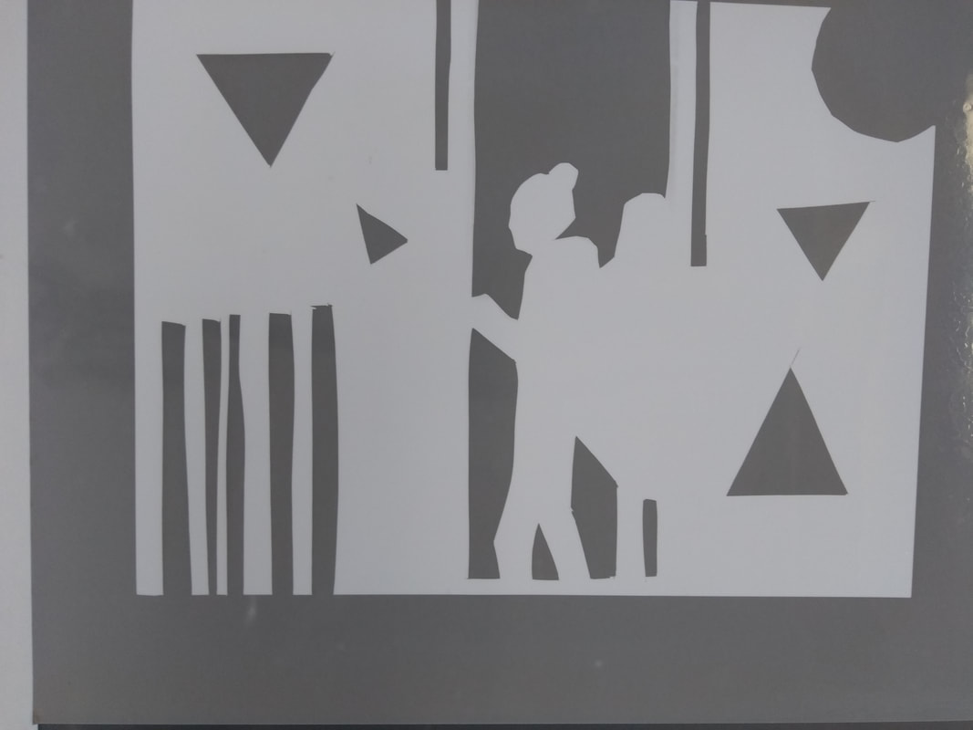
The photograms that turned out successfully/Final piece...
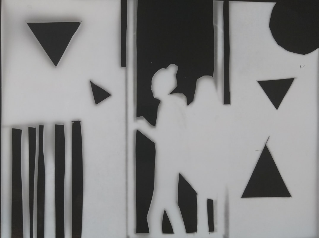
These four photograms above are the ones I have done that have turned out successfully. I think these have turned out successfully as they look the most interesting and as the background is very dark it makes the foreground stand out more which effectively makes these photograms look the most intriguing and allow them to comply very much to the theme of edges. As these images have turned out very successfully and I am very pleased with them, this is my final piece. I really enjoyed doing this experimentation as it was challenging yet fulfilling, I found it challenging because I had to do and try a lot of different methods and timings to figure out and find which ones looked the most professional and successful, however, it was fulfilling as when I did eventually create some that did look successful it was very pleasing. Overall, I am very pleased with my final product as it complies with the theme of edges very well as each photogram contains a variety of different edges within them and this is what makes it suit the theme.
